
A Step By Step Guide To Making KILLER YouTube Thumbnails

It’s always a struggle making thumbnails that drive in clicks. But STOP worrying about that, since this guide will help you streamline the process!
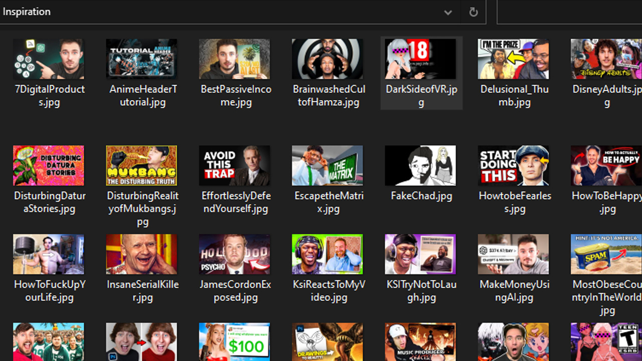
Step 1: Find inspiration.
The hardest part of making a thumbnail is coming up with a concept in the first place. Instead of wasting TONS of time trying to figure out what you want to make, STEAL from what other people are doing. Now, don’t get mad at me for suggesting this, get angry at Pablo Picasso, who said “Good artists copy; great artists steal”. To make it clear, I am NOT saying that you should use other people’s thumbnails, but take elements from their work that are proven to work.
For example, depending on what niche your channel is in, I’d recommend scanning through the MOST POPULAR channels of that niche, and studying their thumbnails. Sort their videos by most popular, and look at exactly what they’re doing. What kind of colors do they use? Are their thumbnails simple? Is there any text? Really dissect and break down whatever you see. Then, with that knowledge, you could apply it into your own thumbnails.
I recommend making a folder on your computer with thumbnails that you know are doing well/inspire you. That way, once you make another thumbnail, you could just pop it open, and get quick inspiration. To download other people’s thumbnails, use a site like boingboing.net. There, you can get a high quality version of any of your favorite thumbnails. It’s way better than screenshotting. Eventually, over time, you’ll have a folder like mine, filled with potential ideas.
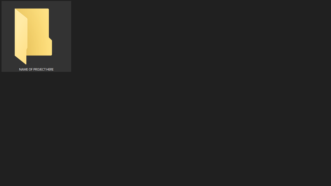
Step 2: Gather your assets.
Assuming that you have an idea for your thumbnail, it’s time to start picking your assets (aka the images/overlays you’ll be using in the thumb). Start by making a folder, and naming it after the project you’re working on. You want to keep everything organized so the process is completely frictionless.
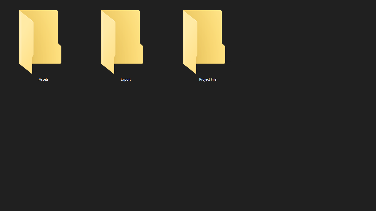
Then, click on that folder, and make 3 separate folders. One called: Export (this will be for the final product), another called: Project File (this is self explanatory), and one more called Assets (you get it).
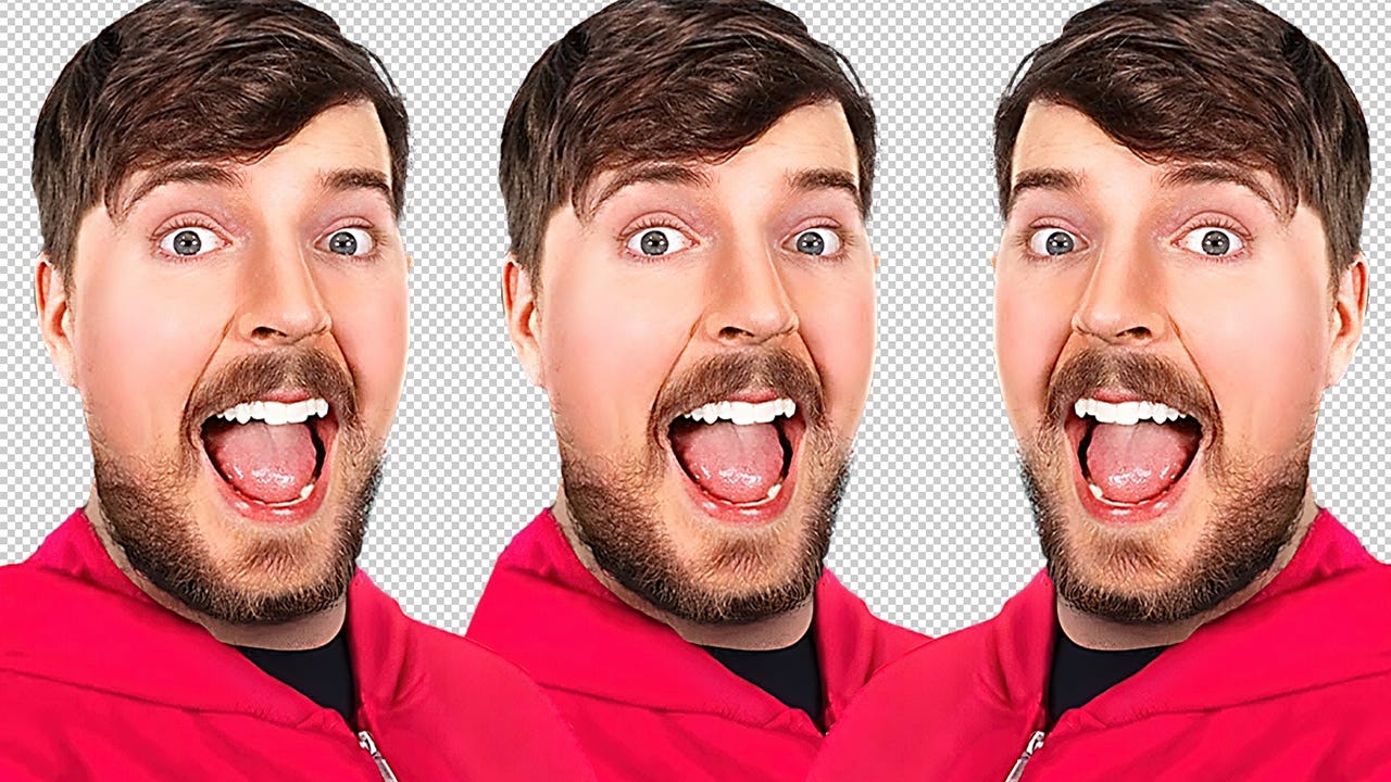
Now that you’re done organizing, start dragging the files you’d like to use into your Assets folder. Keep that open for easy access. MAKE SURE that the main elements in your thumbnail are high resolution images (1080p+)! The biggest mistake people make is using images that are less than 1080p in quality. If you use assets that are 720p or lower, especially if they are the focal point of your image, your thumbnail will look like SHIT 💩.
Regardless, the more pixels you have to work with, the more freedom you’ll have while editing your image. So, whether you’re making thumbs for yourself or a client, make sure you’re getting tip-top quality!
Step 3: Text or NO TEXT??!
Here’s a piece of advice, STOP PUTTING TEXT IN YOUR THUMBS FOR NO REASON. Text is something that should be used sparingly, if at all. I notice that people LOVE putting bodies of text in their thumbnails, that only take up unnecessary space, and add no value at all. If you want to figure out whether or not to use text, ask yourself the following 3 questions:
1. Am I just copy pasting the title into the image? If so, don’t because that’s pointless. The title is already above your thumbnail, so no need to write it again.
2. Does the text add more context to the title? Ex: Say your title is Spending 3 Days In A Barrel, and you use the text “Day 2” somewhere in the thumb, that’s good! It compliments the title and adds intrigue to it. But, say you use the same title, but your text is “3 Days In A Barrel!” instead, that’s bad. Just don’t even use text at that point because it adds nothing to the image.
3. Is the text distracting, and is there too much? If you are adding in text, make sure to use as few words as possible. The more words you use, the more cluttered it will be. And, the more cluttered your image is, the higher the chance the viewer will scroll past your video.
Go through these quick questions every time you make a thumbnail, instead of adding in useless text.
Step 4: Making the thumbnail.
First, drag in all the assets that you decided to use, into your canvas. Start by playing around with the placement, and seeing where each element should be. As a general rule of thumb, the main subject is often placed on the left or right side of the thumbnail (sometimes the middle), and should be chest level-up in terms of size.
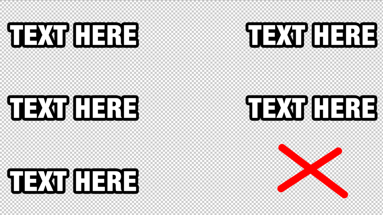
On the other hand, when it comes to text, you should place it anywhere BUT the bottom right. Anything in the bottom right section will be covered by YouTube’s timestamp, so avoid placing it there.
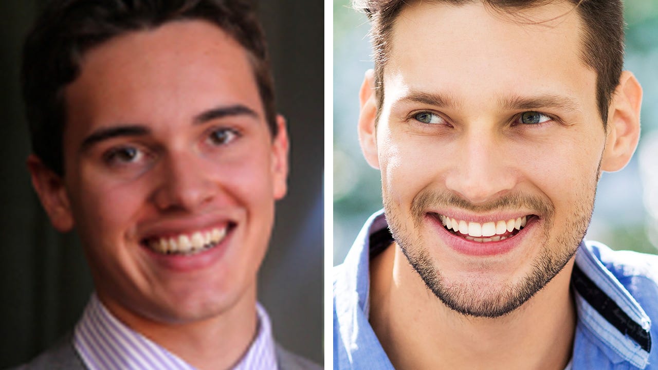
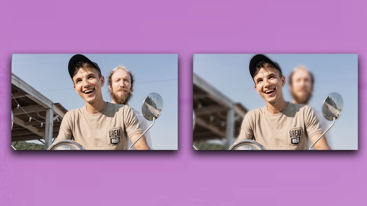
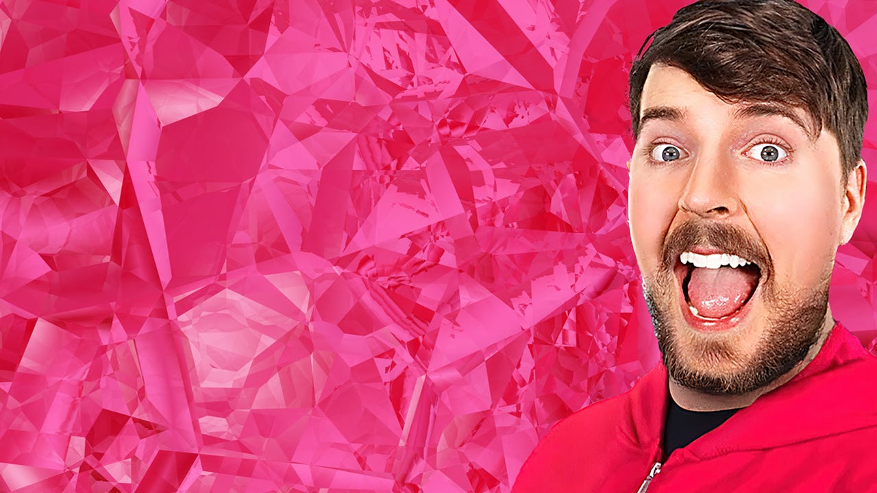
Once everything is placed how you want it, start taking into account what elements you want to make stand out more vs less. For example, the main subject (aka the person or item in your image that’s important) should stand out the MOST in your image. To do that, you can use contrast. Contrast can be achieved in many different ways, but I’ll give you two examples. You can use textural differences to separate one element from another. Have you ever wondered why it’s so pleasing to look at an image with a deep blur in the background?
Well, not only does it make the subject pop out of the image more, creating contrast, but it also leads the viewer's eye to the important elements of the image much faster! Isn’t the difference below very clear?!
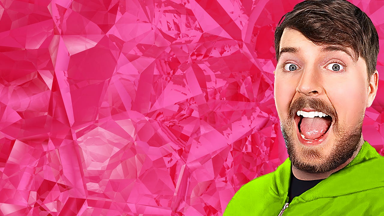
Another way to create separation is through the use of color. When an image has too much of the same color, it becomes very hard to know where to look first. This is called a monochromatic image.
But, using basic color theory, we can make certain elements stand out more. If you’re not familiar with it, don’t worry, it’s very simple. Have you ever heard of complimentary colors? These are colors that are opposite of each other on the color wheel. Check this color wheel as an example:
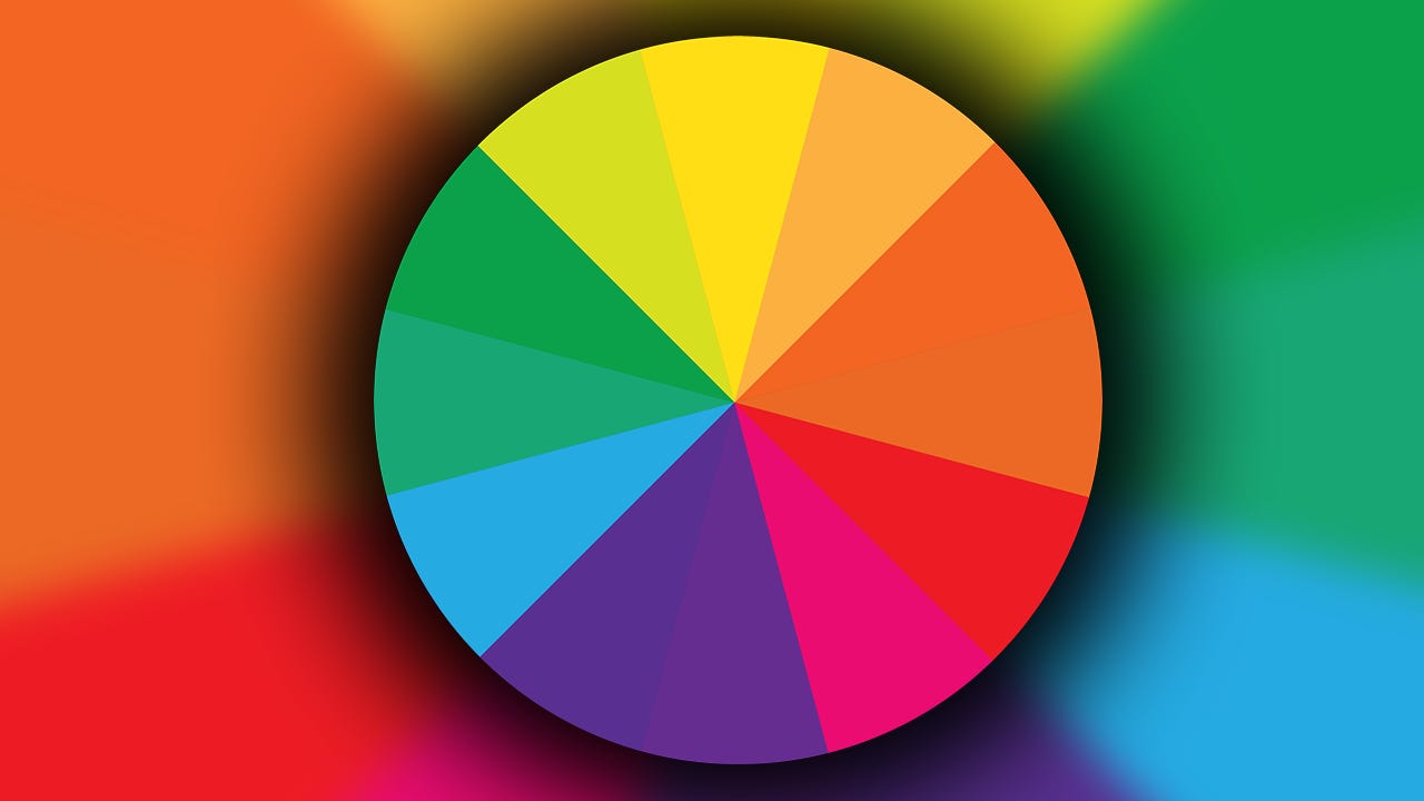
Say that the main color in your image is PINK. If you look on the opposite end of this wheel, that color is YELLOW-GREEN. So, to create some contrast, use the color YELLOW-GREEN on your main subject. This will easily lead the viewer's eye to them, which is what you want.
Lastly, before you finalize your thumbnail, make sure that you keep the image as uncluttered as possible. Less is more, especially when it comes to thumbnail designs. Statistically, people only spend 1 second or less looking at an image as they scroll through social media. So, if too much is going on, they won’t want to spend time figuring things out. That could mean losing potential viewers!
Step 5: Wrapping up your thumbnail.
With all of the major steps out of the way, this part is my favorite. Start tweaking around with the filters in your program, to enhance the quality of your image even further. I like to start with the main subject. Use brightness and contrast, hue and saturation, sharpness, curves and color layers to make them pop even more!
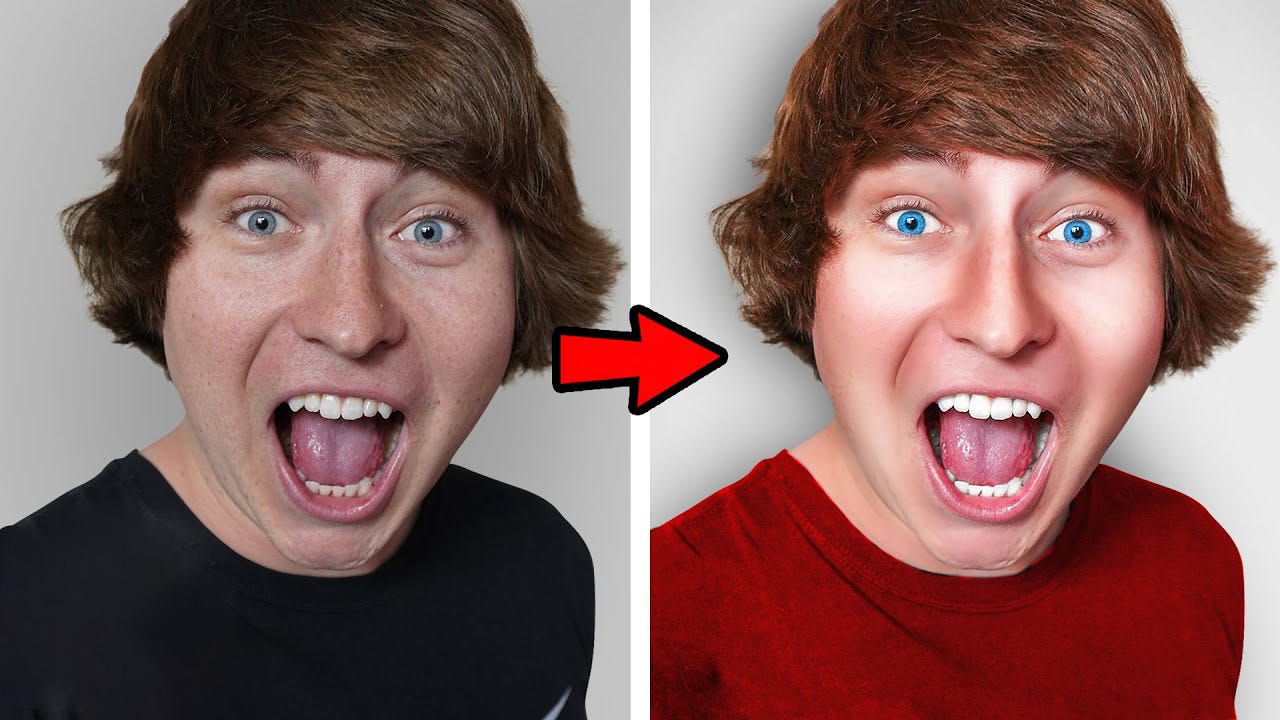
You may also want to add overlays and other layers to the background/foreground to add some extra spice to the image. You can use google to find high quality overlays. Just search whatever it is you want with the keywords “overlay” or “png” at the end of it.
Feel free to add more effects to the subject and background. However, keep in mind, you want to keep things simple. Whatever you add SHOULD NOT make the image feel more cluttered. Once everything is all done, you can also color correct your image to enhance it even further! Finally, once everything is done, export your image as a 1920x1080 JPEG file, and you’re set! Using ALL tips I just gave, I made a quick thumbnail like this:

Step 6: Contact me for 1 on 1 thumbnail design coaching!
Thank you so much for taking the time to read through this document! It means a lot that you’re interested in my advice, but I have a lot more to give. Contact me on discord at ultraxxiii, so I can help take your thumbnail designing skills to the next level!
PS: Check out my portfolio here, to see the kind of work that I’ve done!